Kumi Hori's Inspirational Art of Deconstruction

Designer Kumi Hori impressively deconstructs Biliktu Foundry's BM Ikon typeface, crafting new forms with precision and creativity.

Kumi Hori's Inspirational Art of Deconstruction
Illustration: Kumi Hori

Kumi Huri, a remarkable designer, published an article about their innovative approach to deconstructing a font, Biliktu Foundry's BM Ikon typeface. With precision and creativity, they redraw the typeface, categorize its similar elements, and craft new forms from it.

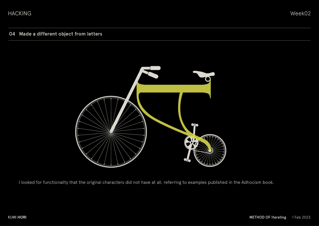
They even made a bicycle out of type! Be sure to read the full article to learn more about their process.
Visit Kumi's Instagram

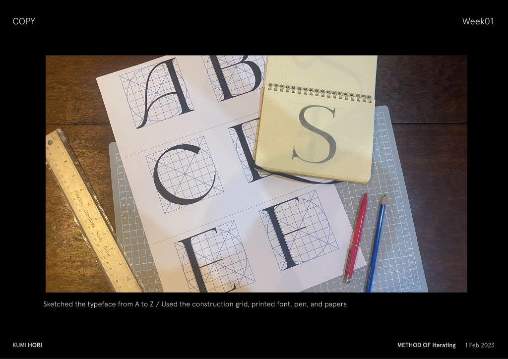
Papers and pen. Someone drew letters on a circular grid as if they are looking at their anatomy.
Photo: Kumi Hori
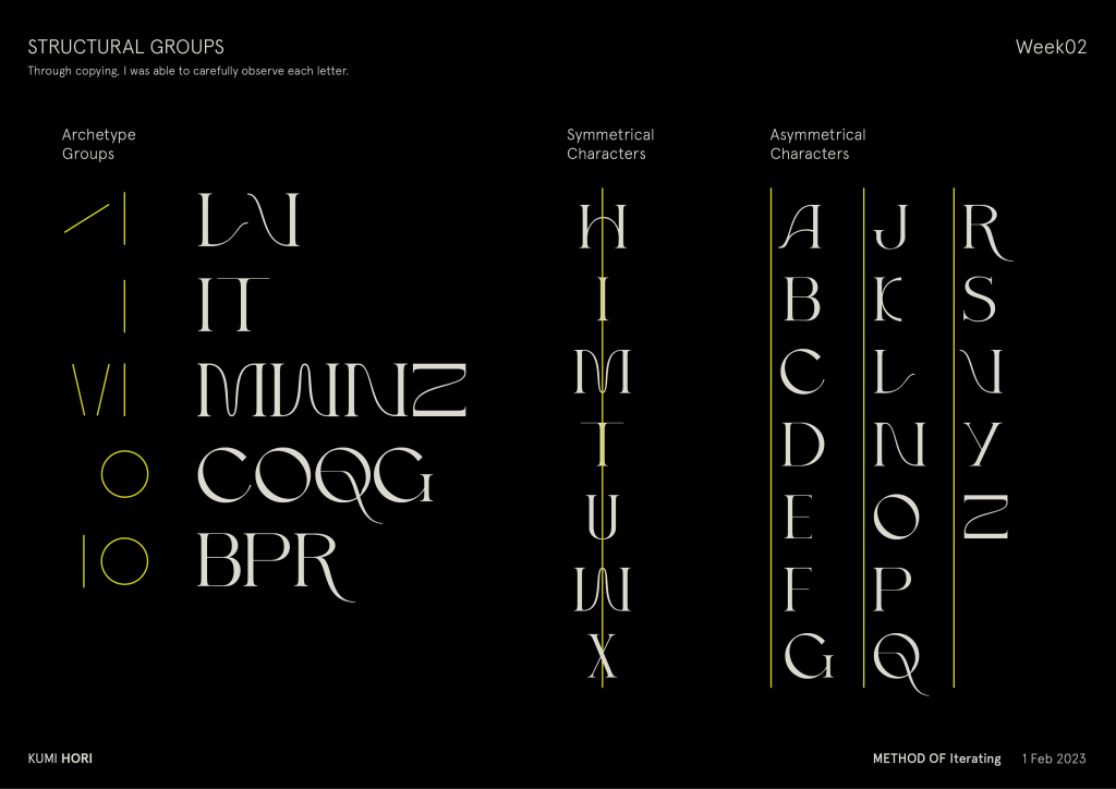
Letters categorized in to three categories. 1-Archetype Groups. 2-Symmetrical Characters. 3- Asymmetrical Characters.
Illustration: Kumi Hori
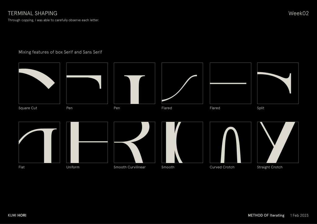
Shapes of letters of this font. Square cut, Pen, Flared,Split,Flat,Uniform,Smooth Curvilinear,Smotth, Curved Crotch and Straight Crotch
Illustration: Kumi Hori
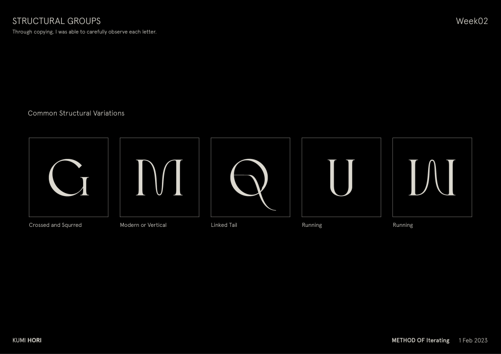
Common Structural Variations of the letters. Crossed and Squrred. Modern or Vertical. Linked Tail. Running.
Illustration: Kumi Hori
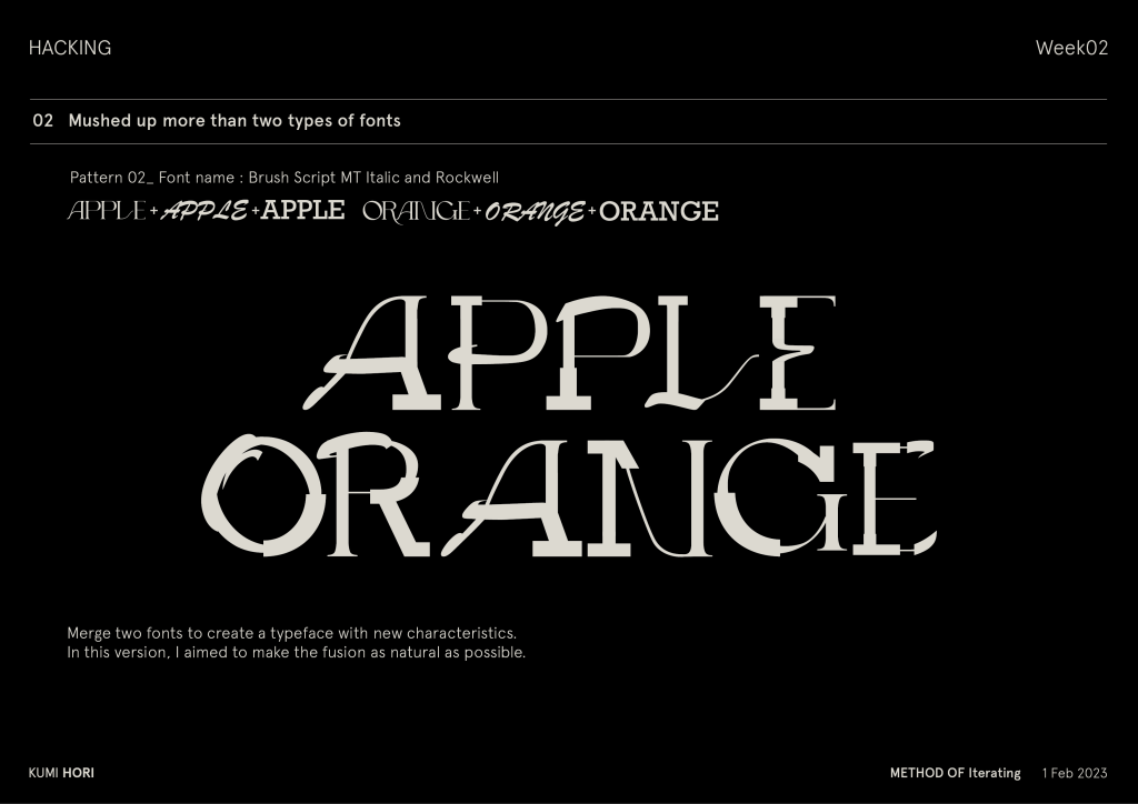
Two different fonts merged into one.
Illustration: Kumi Hori
A simple vector illustration of a bike. Its body is made of letter A.
Illustration: Kumi Hori